Dr. Ariana Candaras, ND
Branding and logo creation for a naturopathic doctor.
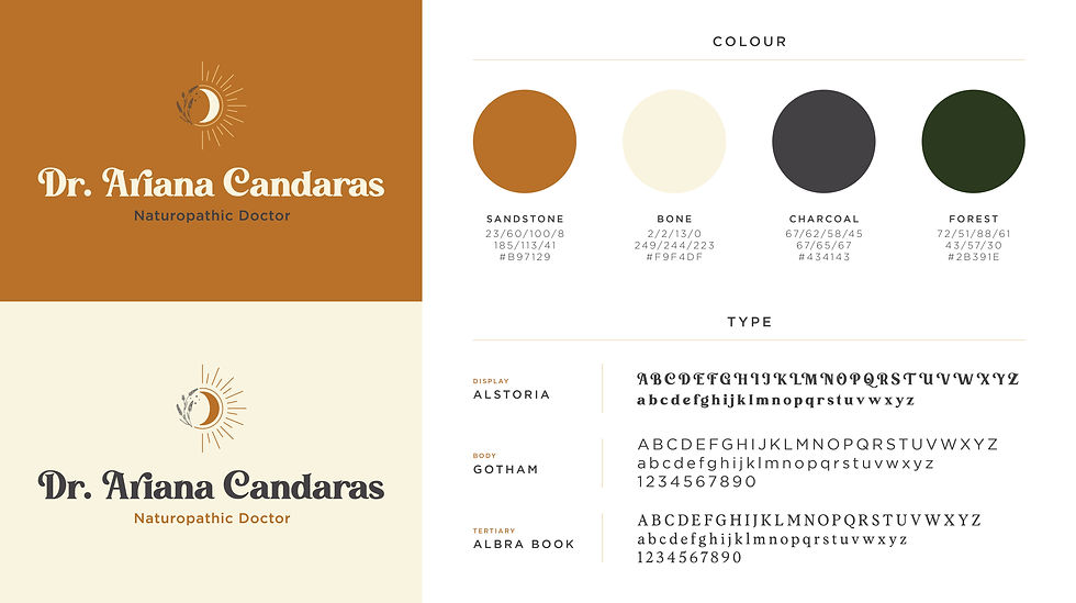
The concept for the logo was simple—naturopathic medicine uses a holistic and natural approach to treating conditions. The circular shape utilized in the icon was ideal to represent this notion of wholeness, as naturopathy treats the body as a whole rather than just the symptom of a problem.
Lavender is often associated with calm, purity and deep healing and as a widely recognized plant, it was selected as the featured medicinal herb in the logo. Meanwhile, the sun and moon are representative of vital life forces and the body's need for balance. In the context of naturopathic medicine, it is understood that human health relies on harmonized flow—energizing during the day (sun) and restorative at night (moon).
The type and colours chosen leaned more into representing the client herself, and her personality. She loves the 70's aesthetic and wanted to subtly move away from the typical "naturopathic look" while still remaining professional. We utilized a funky, retro typeface as our display font, with rounded letters to echo the circular icon, and paired it with Gotham as the secondary typeface.